So far we’ve covered a lot of how Swift the language works, some WatchKit tutorials, and how to get started with some Cocoa classes. However, we have not really done much in the way of actually writing sample apps on the Coding Explorer Blog. It was covered a little bit in the WatchKit tutorials, but there is a lot done there specific to getting WatchKit working. Let’s go all the way back to the basics, let’s write a Hello World app.
For those that don’t know, it is very common to have the first program written by somebody learning a new language be one that somehow displays “Hello World!” At least according to Wikipedia, this goes back to an example from “The C Programming Language” book by Brian Kernighan and Dennis Ritchie. Now, of course the simplest form of this in Swift is just:
print("Hello, World!")
But we’ll do something a bit more advanced than that. You don’t often (or ever) see a console on your iOS device, so that doesn’t help us make an app directly.
This is a pretty basic tutorial, but I want to make it pretty comprehensive for how to start an iOS app. This will even include going over some of the features of the IDE (integrated Development Environment), like the different editors, the utility pane, and the various inspectors therein. This may be a bit too basic for some, but I want this site to be a place for all kinds of iOS developers, especially the beginners. We all had to start sometime, and those are the people I want to help in particular today.
Also, I figured that it’s a new year, let’s start it with how to start a new app.
Creating the Hello World iOS App Project
So, when you first load Xcode, assuming you haven’t turned it off in the preferences, you will see the “Welcome to Xcode” screen. To start a new app, you click the appropriately titled “Create a new Xcode project” button. If you have hidden this page, or prefer using menus, you can create a new project via “File → New → Project…”.
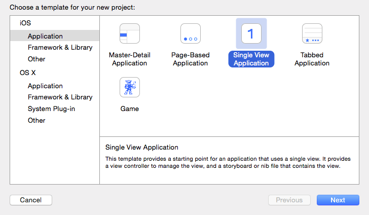
After you click that, you are shown the template screen. You have many choices built in here, which will start you off with an Xcode project that is preconfigured as whichever one you select. For us though, let’s choose the simplest one, the “Single View Application”.
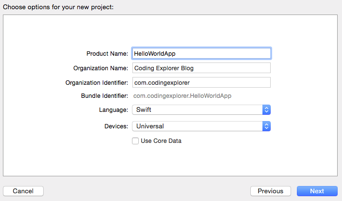
Next, you are presented with the page to set many of the important aspects of your project, particularly your “Product Name” and “Language”, which will be Swift, of course.
Product Name is pretty self-explanatory. The organization name can be whatever you want, but it probably should the the company or name you are releasing your apps under.
The Organization Identifier is part of how your app will be referred to a bit more internally. It is customary to use a reverse domain name of your company as the Organization identifier, so in my case my normal URL of “www.codingexplorer.com” should become “com.codingexplorer”. You can see below it that the “Bundle Identifier” is created based on the product name and the organization identifier. This is part of how your iOS device determines whether an update to your app is the same app or a new one, by checking this Bundle Identifier.
The Language box gives you the choice of Objective-C or Swift. Of course for this blog, we’ll be choosing Swift for this box. The next box has you select what devices this app should run on. You have the choice of iPhone, iPad, or Universal. Apple is heading more in the way of universal apps, so we’ll go with that for now (though this app will be designed for an iPhone, so it will look a bit silly on an iPad). Finally you can click that checkbox if you want Xcode to get some Core Data code ready for you. I don’t know enough about Core Data yet to really recommend whether or not to use this checkbox when using core data. It would probably be best in the beginning at least not to, if only to let you see all of the moving parts of Core Data by having to set them up yourself. After you learn though, I don’t know if it is better than doing it yourself or not.
As of Xcode 7.3, there are also 2 more checkboxes at the bottom, “Include Unit Tests” and “Include UI Tests”. The first one creates a separate target that you can write tests for your main app’s code in. The second is used with Xcode7’s new ability to run tests on a UI, as opposed to calling code directly. For this app, we will leave these unselected.
When you click next, you will be presented with a save dialog, asking where you want to save your project. Wherever you save it, a folder will be created with your app’s name, and inside will be the Xcode project, and a folder for each target your app has (which is going to be the app itself, and a test target right now). You also have the option to create a Git repository for your project either locally or on a server.
After you click the “Create” button, the files for your project are generated and you are probably looking at your AppDelegate.swift file.
Setting up the Storyboard
Now we’ll set up the storyboard. This app will present the user with a UILabel and a UIButton. When the UIButton is tapped, “Hello World!” will show up in the UILabel.
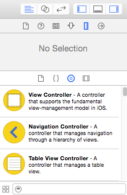
Make sure that you are showing the Utility Pane on the right side. The shortcut for this is the box with a thick vertical line on the right side, which should be in the top right of your editor (and of the screenshot below). With that open, on the bottom of the Utility pane, make sure you have the Object Library shown, which is done by having the buttons selected that looks like the original iPhone home button (a circle with a square in it). This is also shown in the screenshot below.
Inside the Object Library, we will drag out a UILabel and a UIButton onto the storyboard. You can scroll through it, but I prefer to search using the search bar at the very bottom of the Utility Pane. Once you find the object in the list, you click and drag it out. Hold your cursor wherever you want to put the object on the ViewController, and then release the mouse button.
Let’s have these two objects be horizontally centered. Place them roughly where you want them to be using the guidelines the Xcode shows when you are near the margins or center. Don’t worry about being exact, we’ll get to that later.
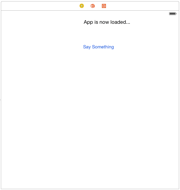
You can customize what the label and Button to say by simply double clicking on them. That will put them into edit mode with a cursor showing, and you can type in what you want there. Let’s change the label to say “App is now loaded…” and the button to say “Say Something”. After filling in these, you might need to recenter them, since it leaves their left edge wherever it was when you started loading. You could also wait and have Xcode do it for you when we do one of the next steps.
Set Object Locations with Auto Layout
We’re going to use size-classes and Auto Layout in this app to make it universal, so we’ll need to set up someAuto Layout constraints. Don’t worry, it’s pretty easy for this app. We won’t specialize size-classes for Compact vs Regular for now though, so it will look a bit silly on an iPad.
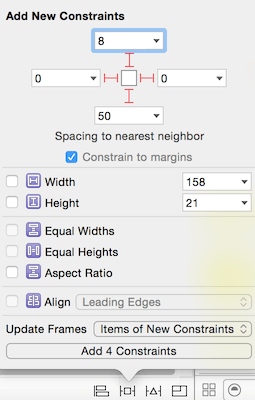
Select the “App is now loaded…” label, and click on the Pin button in the bottom right of the editor area. The “Pin” button is what the popover is pointing to in the screenshot below. If it is not aligned to the top guide, set the top constraint to 8. If it is already, make sure to click the dotted red “I” shape between the top constraint box, and the reference box in the middle to make the dotted lines solid red. We’ll set the left and right constraints to 0, and the bottom one to 50.
Doing all this will make constraints that tell the label to be snug to the left and right margin, 8 points from the top margin, and 50 away from the nearest neighbor below it (being the button in this case).
We’ll also change the “Update Frames” option to “Items of New Constraints”. This will update the label’s actual location on the storyboard to be in accordance with the new constraints. Since we have the bottom constraint to the button, it will also move the button to be 50 away from the label. At the moment it also moves it to the far left like the label, but that’s more because it doesn’t know what to do horizontally yet with it. That’s the next step.
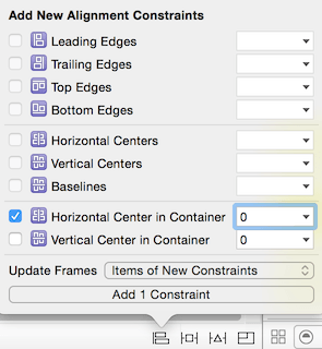
We want the button to be in the center, so let’s set that. Select the button and click the “align icon” in the bottom right area of the editor area. It’s just to the left of the “Pin” icon, and also shown in the screenshot below.
There we’ll only enable the “Horizontal Center in Container” checkbox, and leave its constant at 0. This will set the center of the button to the center of the container itself. Again we’ll also update the frames for items of new constraints. When you click the “Add 1 Constraint” button it will move to the center as we requested. If you leave the “Update Frames” box to its default, they won’t move, but show some auto-layout warnings telling you to move it yourself.
At this point you’ll see that the UIButton is centered, and while the UILabel itself is effectively (since it is pinned equally to each side) centered, the text in it is not.
We pinned the label to the sides because the we want the label to be big enough when we put different text in. The label won’t automatically resize to fit its content.
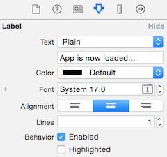
Now to align the text itself, click on the UILabel, and in Attributes Inspector in the Utility Pane. The attributes inspector is that icon that is an arrow pointing down along a line (the blue one near the center of the screenshot below), kind of like a slider on some systems. In there, click on the center text alignment button, which looks like a text alignment button in Pages or Word.
Now that we’ve done that, we have everything centered and ready for the code.
Customizing ViewController.swift
Now we need to wire up the UILabel and the UIButton to be accessible in the code. We’ll need to wire up an outlet to the UILabel, and an action to the UIButton.
The easiest way is with the assistant editor. You can open the assistant editor with the icon that has two intersecting circles on it. While we’re there, we might as well turn off the Utility Pane to get a bit more room for the assistant editor, since we are done with it now.
There you will see that it will (by default) open something in a window on the right that is associated to what is in the main editor window on the left. In the case of our storyboard, it will open up the ViewController that goes along with it, which was named by default ViewController.swift.
With the assistant editor, we can make these by dragging from the main editor, to where you want the code to appear in the ViewController.swift file. This can be done a few ways. If you have a two (or more) button mouse, you can simply do it by dragging with a right click. This is my preferred method. If you have only 1 button (or a trackpad), you can do this by Control dragging what that single button (or the left button if using a 2+ button mouse for this way. Either way, when you release the drag on the code, it will present you with a window to set the settings for your outlet or action. I will refer to the dragging as Ctrl+Drag in the rest of this tutorial, despite that I prefer right-click dragging.
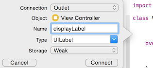
So Ctrl+Drag from your UILabel to where you want the outlet to go in the code. This will open a window like the one below. Make sure the “Connection” says “Outlet”. Then give it a name, for this tutorial, let’s name it “displayLabel”. The other two can stay as their defaults. Click the “Connect” button and it will create the code for the outlet.
Since this screenshot was originally taken, it has been suggested by Apple to set your Storage type to “Strong”, instead of “weak” as is shown in this screenshot.
You can check out WWDC 2015 — Session 407 — Implementing UI Designs in Interface Builder, which also shows some great information about how to use Interface Builder. The link is even timestamped to go to the part about the Storage type specifically, neat!
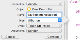
Next, Ctrl+Drag from your UIButton into the code to get a similar box. However for this one, make sure you set the “Connection” to be an “Action”. Once you set that, the options available in the box will change. The name is still there though, so we’ll name it “saySomethingTapped”.
Next is the “Type option. When the action is created, it will usually have a parameter named “sender”. It will be of the type specified in this “Type” option. By default it is set to be an “AnyObject”. If you do something with the sender that is dependent on type, setting it here makes it so you won’t have to type cast it later. Even if I didn’t have to use it though, I usually set it to be the type that it should be. I don’t know if this adds significant overhead, but this is my preference unless I hear a good reason not to. For now, let’s set it to be the appropriate “UIButton”.
Then you can set which event to trigger this auction method on. The default is “Touch Up Inside”, meaning that once you lift your finger, as long as it is still inside the button, this will trigger. There are many different options, but this is the most common, and what you will probably usually do.
The final option is the “Arguments” option. By default, the parameter included is the “Sender”, as mentioned earlier. You can set it to have no arguments, or even set it to show the event that caused it too. For now, let’s leave it as the “Sender” option.
Click the “Connect” button and your action method will be written in the code. Now, like any other method, you write what should happen when this method is called inside. Despite all of this setup, the code will be pretty simple.
The UILabel class has a property just called “text” that takes or returns a String (technically an NSString) of the text for the UILabel. So we will set it to the String “Hello World!”, like in the code below.
@IBAction func saySomethingTapped(_ sender: UIButton) {
    displayLabel.text = "Hello World!"
}
That’s it!
Just for completeness sake, here is all of the code in the ViewController.swift file:
import UIKit

class ViewController: UIViewController {

    @IBOutlet var displayLabel: UILabel!

    @IBAction func saySomethingTapped(_ sender: UIButton) {
        displayLabel.text = "Hello World!"
    }
}
This does include some of the original boilerplate that it was created with. I wanted to make this app as simple as possible, so we didn’t remove some of the boilerplate we don’t really need for this app.
Running the App
So now you run the app with the big “Play” button in the top left of Xcode. You then need to set what device to run the app on. You can select a physical device (if you have a paid developer license). Otherwise, or even just for simpler testing, you can run it in the simulator. Choose the simulated device to run it on from the same menu.
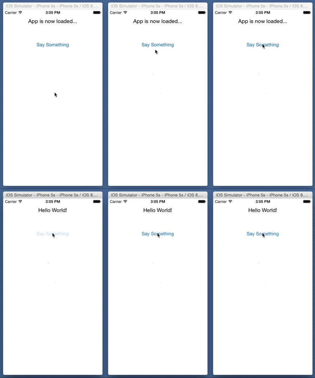
Then wait a bit while the simulator loads. Mine took about 30 seconds to load. Then click the button in your app, and watch it change the text in the label!
Conclusion
Screenshots taken from Xcode 6.1.1, code checked against version listed at top of the post.
While this was a simple app, the post got up to at least 2,700 words. I wanted this to be pretty comprehensive for the beginners, so that I wouldn’t assume anything, even that people would know what the different panes or inspectors were called. Don’t worry, most tutorials won’t have THAT much detail in them. Now in future tutorials, readers can be directed back to this one for a lot of the early setup stuff if they need it.
I hope you found this article helpful. If you did, please don’t hesitate to share this post on Twitter or your social media of choice, every share helps. Of course, if you have any questions, don’t hesitate to contact me on the Contact Page, or on Twitter @CodingExplorer, and I’ll see what I can do. Thanks!


